Logos are everywhere around us, from the clothes we wear to the food we eat and the technology we use. At first glance, most logos may look like simple designs, but many of them hide creative and clever meanings. A well-made logo is more than just a symbol. It represents a brand's story, values, and vision in a single image.
Some use shapes and letters in smart ways, while others include symbols that reflect culture, history, or emotions. These hidden meanings make logos unforgettable and give them a special charm. In this blog, we'll explore 53 world-famous logos that carry secret messages, clever designs, and unique ideas you may have never noticed before.
Logos are not just random shapes or pretty designs. Many of them are created with deep thought and hidden meanings behind every curve, color, and symbol. A good logo tells a story without using words.
It connects people to a brand in ways they may not even notice at first. For example, some logos hide letters, symbols, or clever shapes that reflect the brand's values, history, or mission.
Others use color and space to create a feeling of trust, speed, or creativity. When we take a closer look, we realize that logos are more than visuals. They are clever tools that carry hidden messages, helping brands stand out and stay memorable in our minds.
Logos are more than symbols. Many carry clever secrets, hidden shapes, or stories that reflect brand identity. Discover how some of the world's most recognizable logos hide powerful meanings right in plain sight.
FedEx's logo is one of the best examples of clever use of negative space. Hidden between the letters “E” and “X” is a forward-pointing arrow. The arrow is subtle, so most people overlook it at first glance.
But once you see it, you cannot unsee it. This arrow represents precision, efficiency, and the forward-thinking mindset of the global delivery giant. For a brand built on logistics and movement, this hidden message communicates their promise without words. It's a simple, elegant, and robust design in action.
Amazon's logo tells a story in two ways. The curved arrow runs from the “a” to the “z,” symbolizing that the company sells everything you could ever need, literally from A to Z. At the same time, the arrow doubles as a smile, with the letter “a” forming a cheek.
This subtle touch connects Amazon's identity with customer happiness. The design is playful yet purposeful, making it easy for customers to remember both the range of products and the service promise in one clean image.
Toblerone is famous for its triangular chocolate bars, but its logo hides a sweet surprise too. The image of the Matterhorn mountain symbolizes Switzerland's alpine heritage. If you look closely, within the white space of the hill sits the outline of a bear. This nods to Bern, Switzerland, the birthplace of Toblerone, where the bear is an iconic city symbol. The hidden bear creates a charming connection between the chocolate and its origins, while rewarding observant fans with a clever design Easter egg.
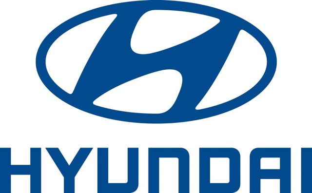
At first glance, Hyundai's logo looks like a slanted "H." But if you take a moment, you'll see something more meaningful. The H is two people shaking hands—one represents the customer, and the other the company. This simple yet clever design sends a strong message: Hyundai is about partnership, trust, and long-lasting relationships. It's not just about selling cars; it's about building connections. That hidden symbolism makes the logo stand out from many other car emblems, which often stick to initials or shapes without a deeper story.

The BMW roundel is one of the most recognizable car logos in the world. The blue and white quadrants inside the circle represent the Bavarian state flag, paying tribute to the company's roots in southern Germany. But there's another layer—when you look at the design, it also resembles a spinning propeller against the sky. This ties back to BMW's history as an aircraft engine manufacturer. That mix of tradition and movement makes the logo special. It isn't just a badge; it's a symbol of innovation, progress, and German engineering excellence.
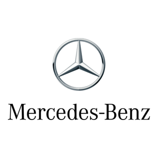
Mercedes-Benz's logo is striking in its simplicity: a three-pointed star inside a circle. But each point has a purpose. They stand for the company's ambition to dominate transportation on land, air, and sea. First introduced in 1909, the star has remained a timeless symbol of innovation, luxury, and power. Even today, it feels futuristic, almost as if it could belong on a spaceship. The design perfectly matches Mercedes' image—forward-looking, refined, and built on engineering brilliance. It shows how a simple logo can carry enormous meaning.
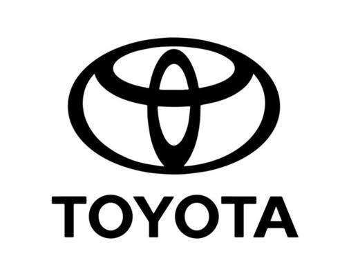
Toyota's emblem looks sleek and modern with its interlocking ovals. But the design hides more than you might expect. If you trace the shapes carefully, you'll find every letter of the word "Toyota" hidden inside. The overlapping ovals also form the outline of a steering wheel, tying the brand back to driving. It's one of the most innovative logo designs out there—clean and elegant at first glance, but full of thoughtful detail. This cleverness reflects Toyota's values: precision, creativity, and attention to even the most minor details.
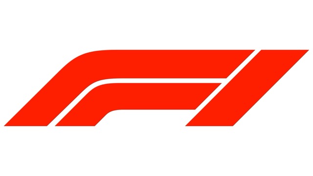
The Formula 1 logo is bold and dynamic, just like the sport itself. On the left, you have the strong black "F." On the right, streaks of red suggest motion, speed, and excitement. But the genius is in the negative space between them. That gap creates a perfect "1," which instantly ties the design to the brand name. It's simple, clever, and bursting with energy—just like a race car on the track. The logo perfectly captures what Formula 1 is all about: adrenaline, speed, and competition.
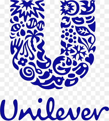
Unilever's logo looks like a simple "U" at first, but when you look closer, it's made up of dozens of tiny icons. Each little symbol stands for something the company makes or believes in—like food, beauty, health, or sustainability. Together, they show how broad and diverse Unilever's product range is. It's not just a letter; it's a picture of everything the company touches. This makes the logo feel alive and dynamic, reminding people that Unilever is part of everyday life in many small but significant ways.
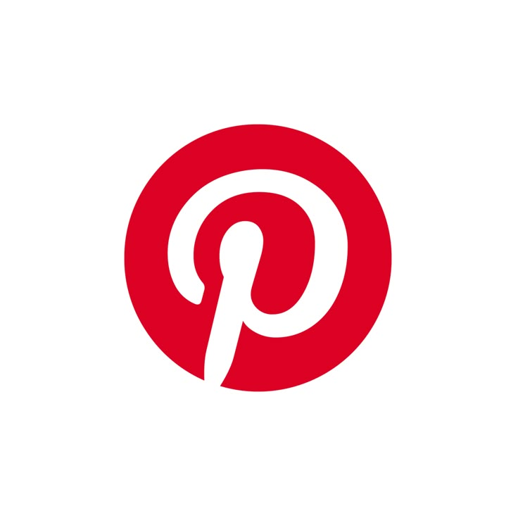
Pinterest's logo is a perfect example of simplicity with a twist. The red "P" doesn't just stand for the company name—it also doubles as a pushpin. That little design choice instantly connects the logo to what the platform does: letting users "pin" ideas, photos, and inspirations onto boards. It's clean, clever, and perfectly in tune with the brand's purpose. The fact that people can recognize the pin shape without even realizing it shows how well the logo works. It's one of those designs that “clicks" the moment you understand it.
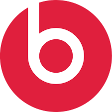
The Beats by Dre logo is sleek and minimal: a lowercase "b" inside a circle. But the real magic is in the hidden meaning. If you tilt your perspective, the circle becomes a human head, and the "b" looks like a pair of headphones. That clever trick makes the logo directly tied to the product—music and sound. It's an instant visual connection, which is why it works so well on their headphones. Beats' design is proof that a simple idea, executed smartly, can become globally iconic.
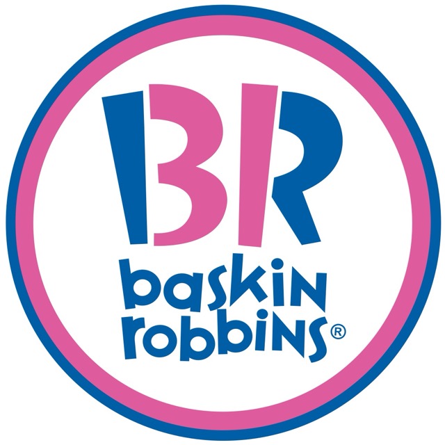
Baskin-Robbins has always been about variety and fun, and its logo shows it brilliantly. Hidden in the "BR" is the number "31" in pink, standing for their original promise of 31 ice cream flavors—one for every day of the month. This playful detail fits perfectly with their brand personality: cheerful, colorful, and full of options. The logo isn't just about ice cream; it's about choice, happiness, and a little sense of discovery. Once you notice the "31," you can't unsee it, and that's precisely what makes the design memorable.
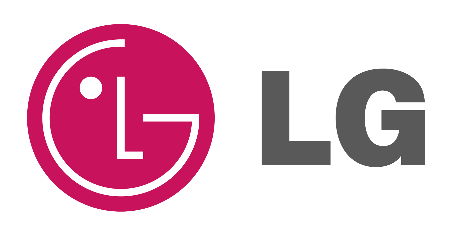
LG's logo may look simple at first—a red circle with "L" and "G" inside—but there's a hidden charm. When you look closely, the letters form a smiling face. The "L" becomes the nose, while the "G" outlines the rest of the face. This playful design makes the brand feel friendly and approachable. It tells customers that LG isn't just about technology; it's about people, joy, and human connection. It's a subtle but powerful way to make a tech company feel warm and trustworthy.
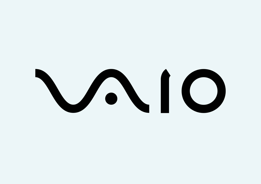
The Sony VAIO logo is a small masterpiece of symbolism. The first two letters, "VA," look like an analog wave, while the "IO" represents binary code—1 and 0, the foundation of digital technology. Together, the logo symbolizes the bridge between analog and digital, which was exactly VAIO's mission when Sony introduced it. It's more than just a nameplate on a laptop; it's a clever story about technology evolving. This balance of creativity and precision makes the logo one of the most innovative designs in the tech world.
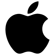
Apple's logo is one of the most famous in the world, but its simplicity hides some clever thought. The bite taken out of the apple makes sure it isn't confused with a cherry or tomato. At the same time, the wordplay of "bite" and "byte" connects the design to computers and technology. It's clean, minimal, and instantly recognizable. The beauty of Apple's logo is that it doesn't need words or decoration—the single bitten apple says it all: innovation, simplicity, and creativity.
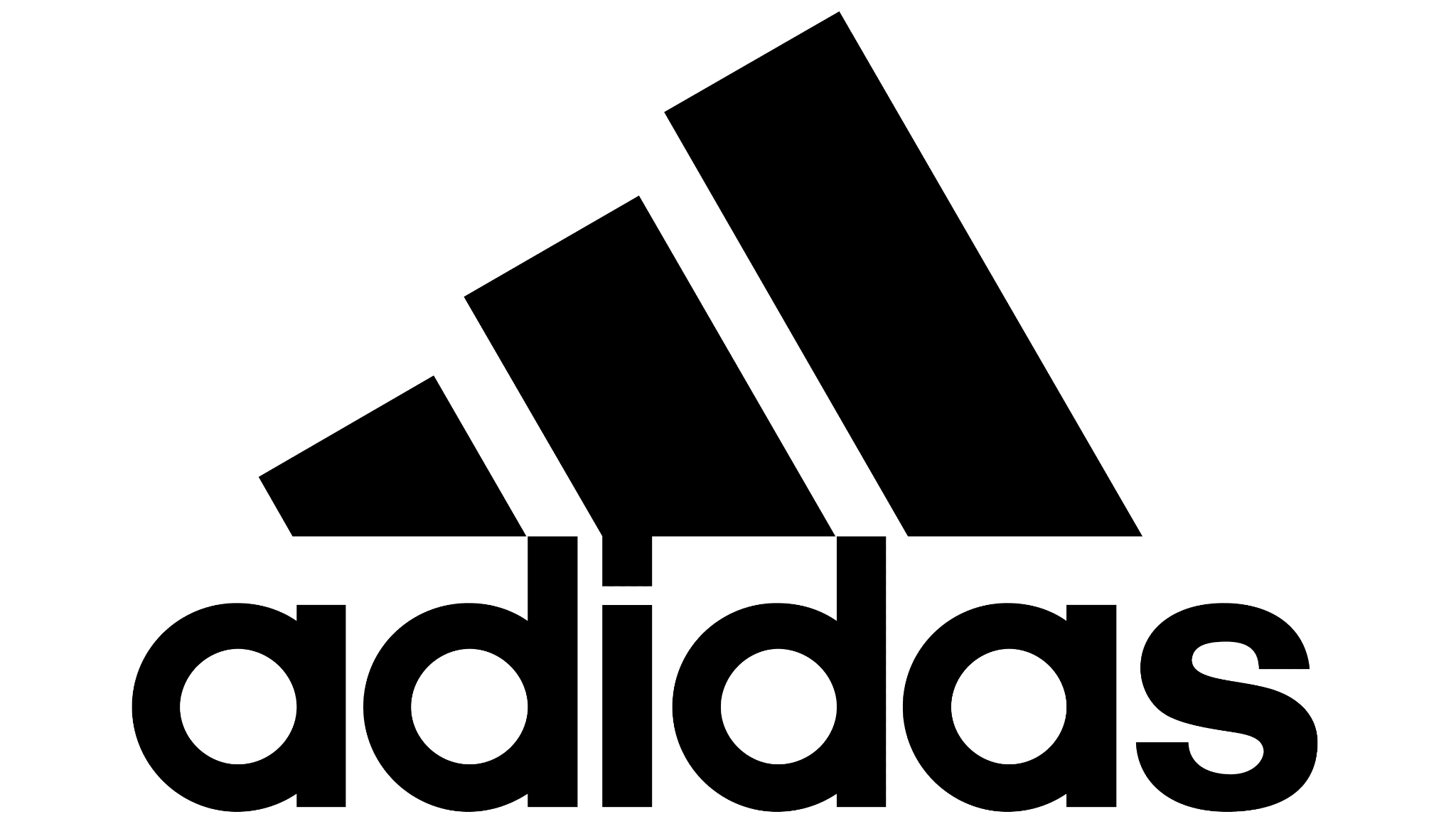
Adidas is known for its three stripes, but there's more to the design than meets the eye. When tilted, the stripes form the shape of a mountain. This represents the challenges and obstacles athletes face and overcome. It's a powerful metaphor for strength, determination, and resilience. Simple as it looks, the design perfectly captures Adidas' identity: helping people push their limits. The mountain imagery turns three basic lines into a story of motivation, making the logo timeless in both sportswear and symbolism.

The Nike swoosh is one of the most recognizable logos in the world, and it's more than just a checkmark. The shape is inspired by the wing of the Greek goddess Nike, who symbolized victory. The swoosh also feels fast, fluid, and full of motion—exactly what athletes strive for. It's simple but powerful, showing speed, energy, and achievement in a single stroke. That's why it works on everything from sneakers to sports jerseys. The logo feels alive, motivating you to push harder and chase success.
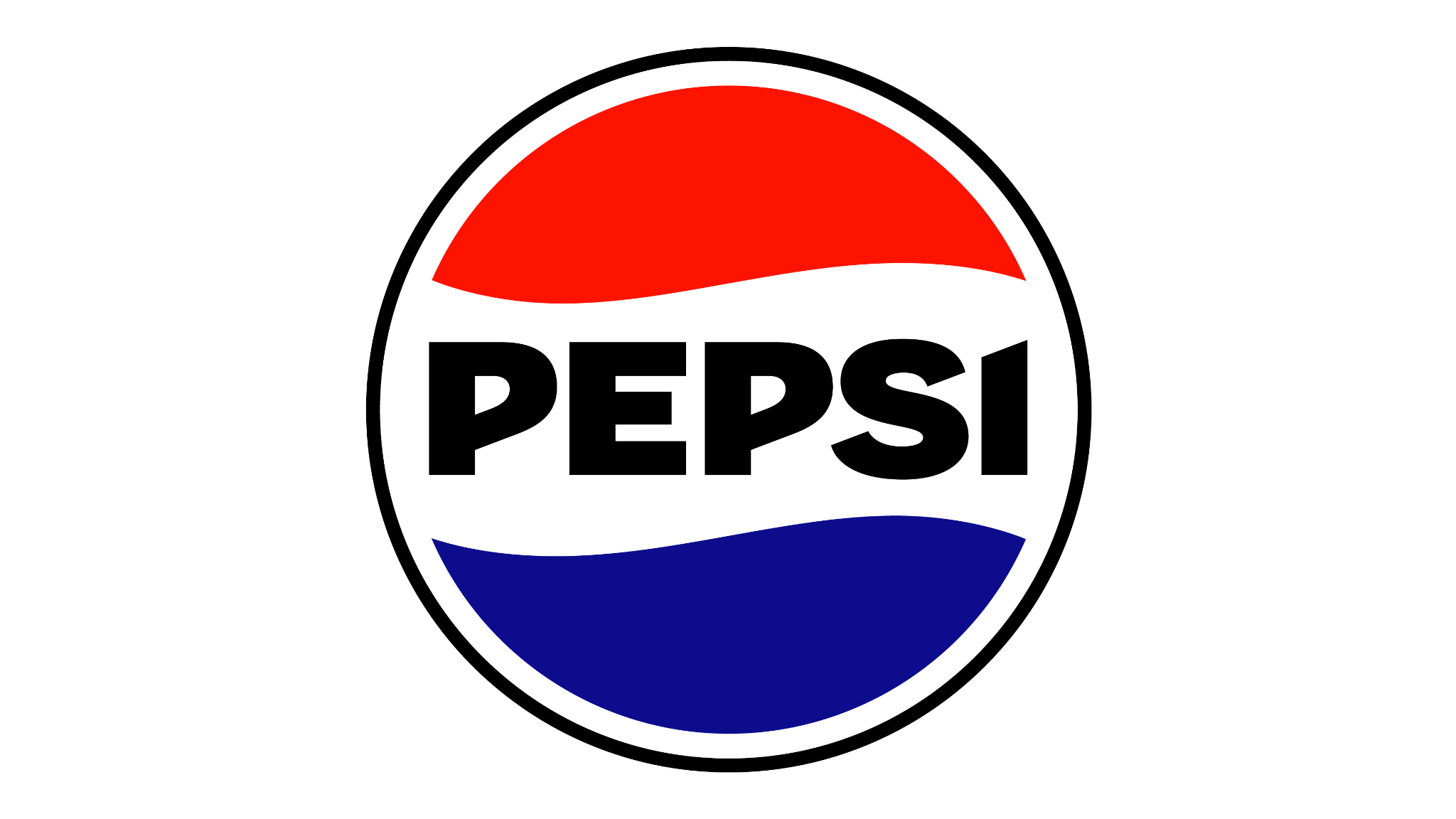
Pepsi's circular logo has gone through many redesigns, but the meaning remains deep. The red, white, and blue waves show the brand's American roots, but the design is more than patriotic colors. The split shape looks like a yin-yang, symbolizing balance and harmony. At the same time, it resembles a globe, showing Pepsi's worldwide presence. This clever layering of meanings makes the logo more than just a soda emblem—it feels universal. It reflects energy, fun, and balance, all wrapped in a simple, modern design.
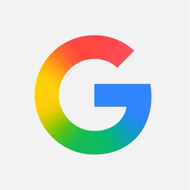
Google's logo may look playful, but the choice of colors is very intentional. Most of the letters are painted in primary colors—blue, red, and yellow. But then, out of nowhere, the "L" is green. This small break in the pattern tells you something about the company: Google doesn't always follow the rules, but it does so with purpose. The simple typeface and bright colors make the logo friendly and approachable, while the little green letter adds creativity and surprise. It's colorful, fun, and perfectly "Google."
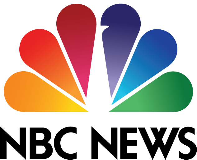
NBC's logo is famous for its rainbow of six colors arranged like feathers. But if you look closely, the white space in the center forms a peacock, facing to the right. The direction isn't random—it symbolizes looking forward with optimism. Each colorful feather also represents a different division of the network, bringing them together under one vibrant design. The peacock adds personality, making the logo cheerful and full of life. It's a great example of how a hidden image can carry a powerful message.
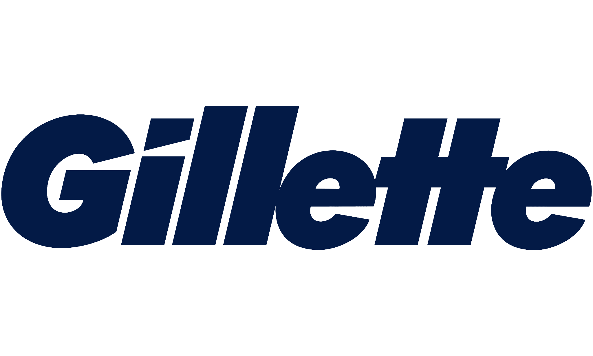
Gillette's wordmark logo looks simple at first, but it's full of subtle detail. The letters "G" and "i" are sliced at sharp angles, almost as if cut by one of their razors. This tiny detail connects directly to the product promise: a clean, smooth, and precise shave. It's a clever way of making the logo feel sharp without adding unnecessary decoration. The design proves that even minor adjustments can communicate a big idea when done with intent and care.
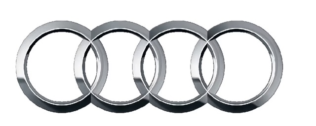
Audi's four interlocking rings are sleek and elegant, but they carry real history. Each ring represents one of the four car companies—Audi, DKW, Horch, and Wanderer—that came together to form Auto Union in 1932. The rings symbolize unity, strength, and collaboration. Today, they've become a sign of luxury, engineering precision, and performance. The design is timeless because it's clean and minimal while carrying a deep story. It shows that sometimes, the simplest shapes can hold the strongest meanings.
Volkswagen's logo looks straightforward: a "V" stacked neatly over a "W" inside a circle. But the balance and clean spacing make it more than just letters. The design subtly echoes the shape of a gear, reflecting engineering and movement. This harmony between form and meaning fits perfectly with VW's brand—solid, reliable, and well-crafted. The logo feels both classic and modern, which is why it has lasted for decades with only minor tweaks. It's a design that proves simplicity and precision never go out of style.
Chanel's logo is timeless and instantly recognizable. The two interlocking Cs stand for the founder, Coco Chanel, but they also symbolize elegance, unity, and sophistication. The mirrored design feels balanced and chic, much like the fashion house itself. It communicates luxury in the simplest way possible—no flashy colors or shapes, just two letters arranged with style. This simplicity has made it one of the most enduring fashion logos in history.
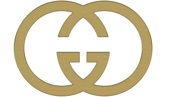
The Gucci logo is another powerhouse in the fashion world. The double Gs represent Guccio Gucci, the brand's founder. But the design does more than spell out initials—it's bold, mirrored, and instantly stylish. The overlapping letters feel symmetrical and iconic, making the logo a fashion statement of its own. Just like Gucci products, the logo blends tradition with luxury, proving that great design doesn't need to be complicated.
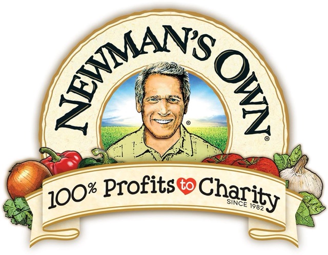
Newman's Own isn't just a food brand—it's a legacy of giving. The logo features actor Paul Newman's face with a halo above his head. The halo symbolizes the brand's mission of donating 100% of profits to charity. It's a rare case where a logo directly reflects generosity and goodwill. Friendly and approachable, it reminds customers that their purchase supports something bigger than just food—it promotes positive change.
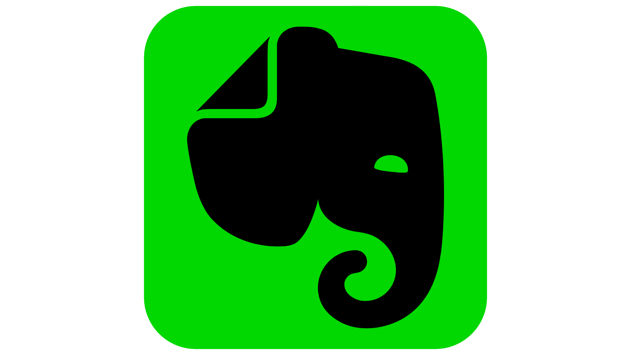
Evernote's elephant logo is clever and meaningful. Elephants are known for their incredible memory, which ties perfectly to the app's purpose of helping people remember and organize Information. Look closely, and you'll see the folded ear shaped like an "E." This subtle detail connects the symbol to the brand name. The design is both fun and functional, making it memorable while telling the story of what Evernote stands for.
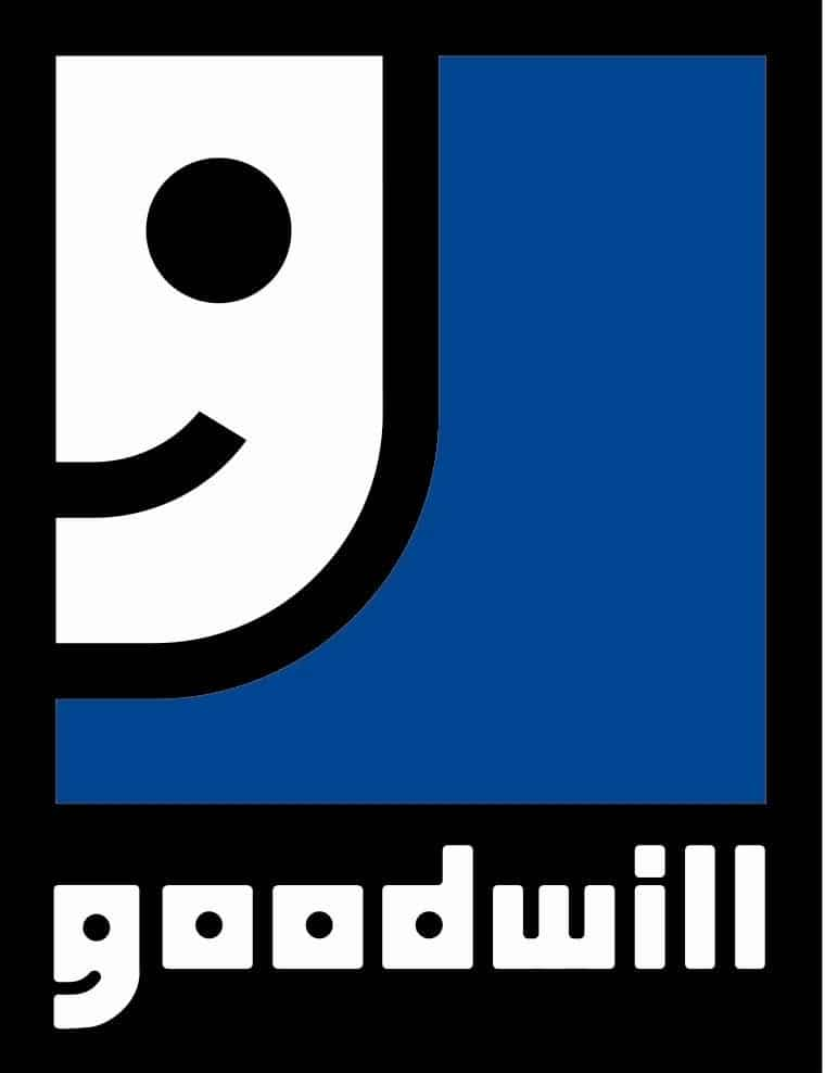
Goodwill's logo is both playful and clever. The lowercase "g" in the wordmark is also stylized to resemble a smiling face. This gives the logo warmth and friendliness, aligning with the organization's mission to help people in need. It feels approachable and positive, showing that Goodwill is about more than donations—it's about spreading joy and opportunity.
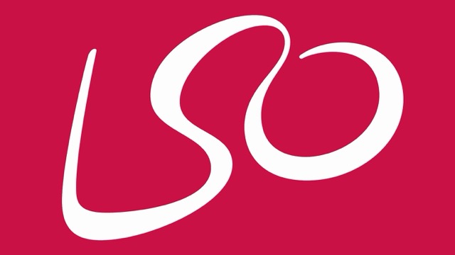
The LSO logo is one of the smartest in the arts world. The letters "L,” "S," and "O" are drawn in a flowing, abstract way that also resembles a conductor waving a baton. This creates a sense of movement, rhythm, and music right inside the design. It's artistic yet simple, a perfect reflection of the orchestra's spirit.

The Tour de France logo looks playful, but it hides a clever detail. The word "tour" contains a cyclist: the "o" is a wheel, the "r" is the rider's body, and the yellow circle represents the sun and another wheel. This makes the logo dynamic and energetic, just like the race itself. It captures both the sport and the joy of cycling in a simple wordmark.
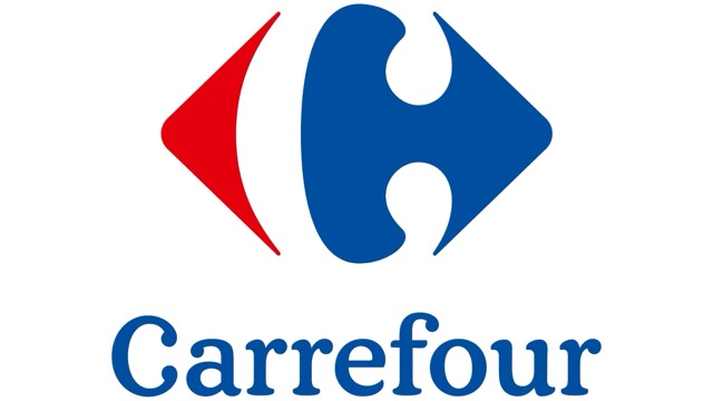
Carrefour, a French supermarket chain, uses a logo with red and blue shapes pointing in opposite directions. Between them, negative space forms both an arrow and a hidden "C." The design reflects choice, movement, and the brand's name, which means "crossroads" in French. It's a great example of making geometry both functional and meaningful.
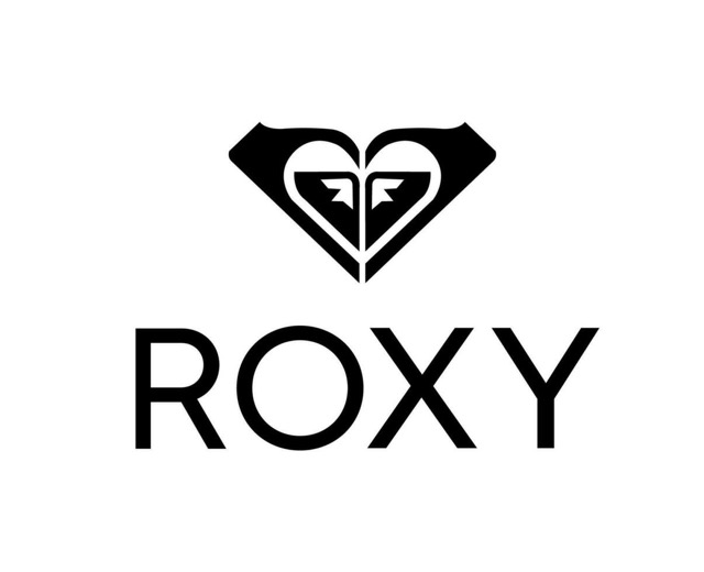
Roxy, Quiksilver's sister brand, has a logo made by mirroring two Quiksilver logos to form a heart. This symbolizes femininity, love, and connection while staying true to its surf roots. The heart shape makes it distinct from Quiksilver yet tied closely to the same adventurous lifestyle.
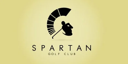
The Spartan Golf Club logo is a masterpiece of dual imagery. At first, it looks like a Spartan helmet, symbolizing strength and history. But look again, and you'll notice the outline also shows a golfer swinging a club. This innovative design blends power with sport, making it memorable and visually striking.
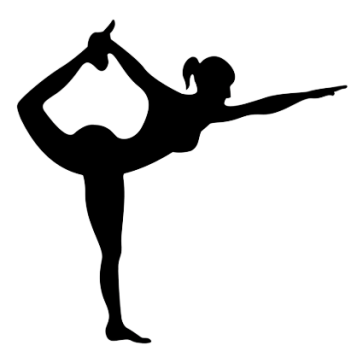
The Yoga Australia logo is a brilliant example of how negative space can tell a deeper story. At first glance, you see a person stretching gracefully in a yoga pose. But if you look closely, the space between the arm and leg cleverly forms the outline of Australia. It's subtle yet powerful, making the logo both cultural and meaningful. For a yoga brand, it ties together wellness, balance, and national identity in one elegant design.
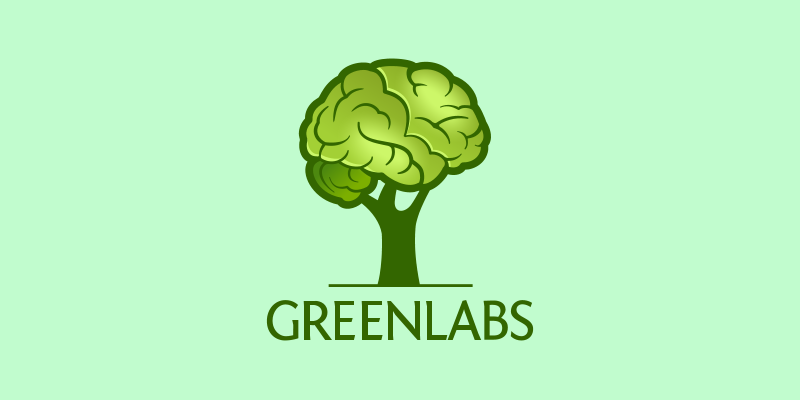
Greenlabs uses a creative design where the leafy canopy of a tree also doubles as the shape of a human brain. This dual symbolism reflects both nature and knowledge—two core themes of the brand. The message is clear: sustainability and innovation can grow together. It's simple, memorable, and it makes you think about science and ecology working hand in hand.

The Sun Microsystems logo is one of the smartest word-based logos ever created. The word "SUN" is designed in a way that you can read it from any direction—up, down, or sideways. This clever symmetry reflects the idea of constant connection, reliability, and global reach. For a tech company, this design was way ahead of its time, proving that function and artistry can meet beautifully.
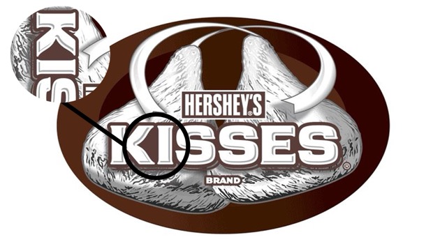
If you look at the Hershey's Kisses logo quickly, you may miss the hidden detail. Between the letters "K" and "I," in the negative space, there's a subtle shape of a Hershey's Kiss chocolate. This playful touch makes the logo not just a wordmark but a visual treat. It's fun, memorable, and perfectly aligned with a brand built on sweetness and joy.
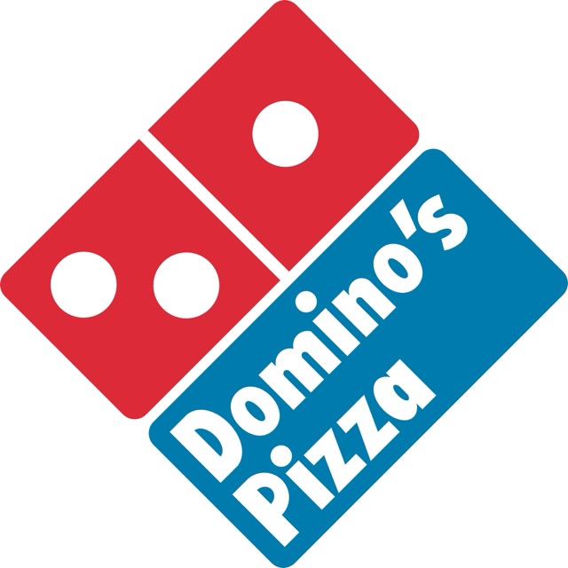
Domino's Pizza has a logo that looks simple: a domino with three dots. But those dots represent the brand's first three original stores. The founders once planned to add a new dot for each new location, but the brand grew too quickly for that to work. Today, the three dots stand as a reminder of humble beginnings and bold growth.
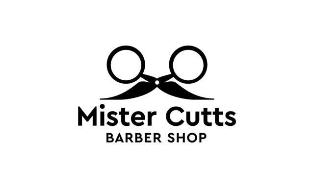
Mr. Cutts has one of those logos you can't help but smile at. The scissors in the design are cleverly arranged to form glasses and a mustache. This playful detail not only reflects the craft of cutting but also adds personality to the shop's identity. It's creative, inviting, and makes the brand instantly recognizable.
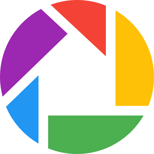
The Picasa logo is a colorful camera shutter, but hidden inside is something more: the shape of a house, or "casa" in Spanish. This design cleverly ties photography to the warmth of home, showing how the app is about keeping memories safe. It's bright, fun, and full of meaning, perfectly reflecting the product's purpose.
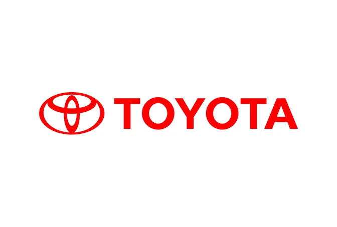
Toyota's alternate reading of its famous oval emblem shows another layer of thought. Beyond spelling out the letters of "Toyota," the overlapping ovals also resemble a steering wheel. This gives the logo a strong connection to driving and vehicles while keeping it sleek and modern. It's a perfect example of multi-layered symbolism done right.
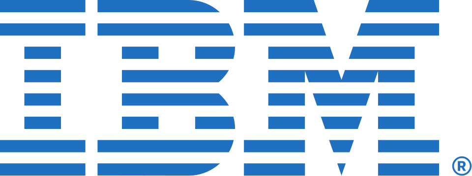
The IBM logo is a set of bold letters made up of horizontal stripes. These lines aren't random—they symbolize speed, efficiency, and dynamism, all values that match IBM's technological vision. The design is simple but incredibly strong, proving that a logo doesn't need complexity to communicate power.
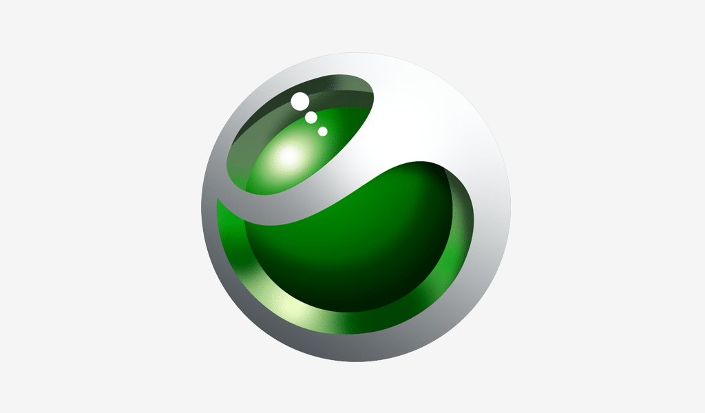
Sony Ericsson's green sphere logo looks futuristic and eye-catching. On closer look, it also resembles a 3D "E," tying directly to the brand name. The glossy, orb-like design reflects innovation and technology while feeling playful and modern. It's the kind of logo that sticks in your memory because it feels alive.
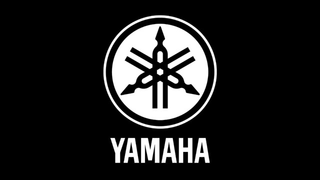
Yamaha's logo is more than just a mark—it's a tribute to music itself. The emblem features three tuning forks crossed at the center. These represent music, sound, and harmony, all core to Yamaha's identity. Since the company produces both instruments and audio equipment, the tuning forks act as a perfect symbol of precision and craftsmanship; it’s a reminder that no matter how much Yamaha has expanded into technology and vehicles, its roots are still tied to music.
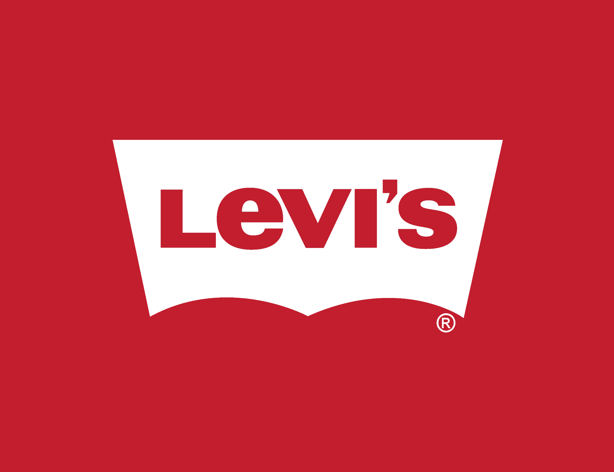
The Levi's logo is famously simple, with its bold red tab and white lettering. But if you pay attention, the shape of the logo resembles the outline of a jean pocket. This is subtle but powerful, instantly linking the brand back to denim and clothing. The negative space is not just clever design—it reinforces the product itself. It's a logo that feels both classic and timeless, just like Levi's jeans.
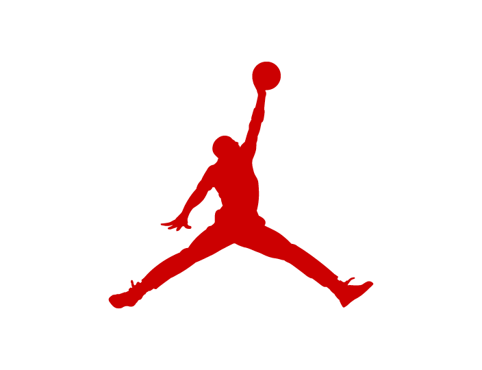
The Jordan Brand, owned by Nike, has one of the most iconic sports logos in history. Known as the "Jumpman," the silhouette shows Michael Jordan mid-air in one of his legendary slam dunks. The logo represents movement, energy, and athletic greatness. Beyond that, it's a cultural icon, symbolizing ambition and pushing limits. Even if you don't follow basketball, the Jumpman is instantly recognizable worldwide.
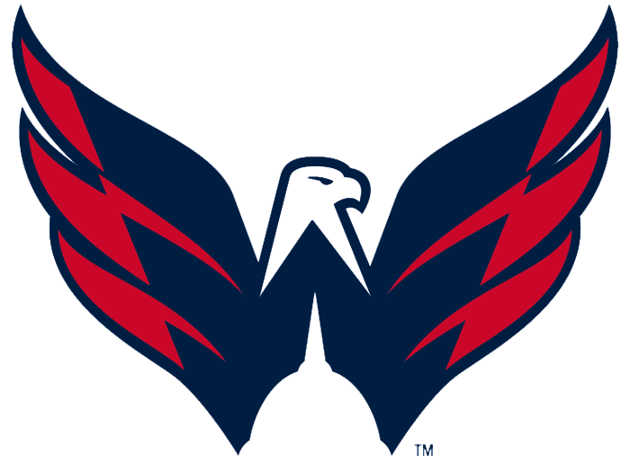
The Washington Capitals' logo isn't just about hockey. The bold eagle wings spread upward, and if you look closely at the negative space, the wings form a "W" for Washington. This clever design captures both patriotism and team pride. It blends the image of strength, flight, and victory while keeping the city's name central to the logo. For sports fans, it's one of those logos that works on multiple levels.
The Milwaukee Brewers' classic logo is a fan favorite because it's playful and intelligent. At first glance, it looks like a baseball glove holding a ball. But look again, and you'll see the glove is formed by the letters "M" and "B." This hidden design makes the logo fun, memorable, and directly tied to the sport. It's one of the best examples of a double-meaning sports logo.
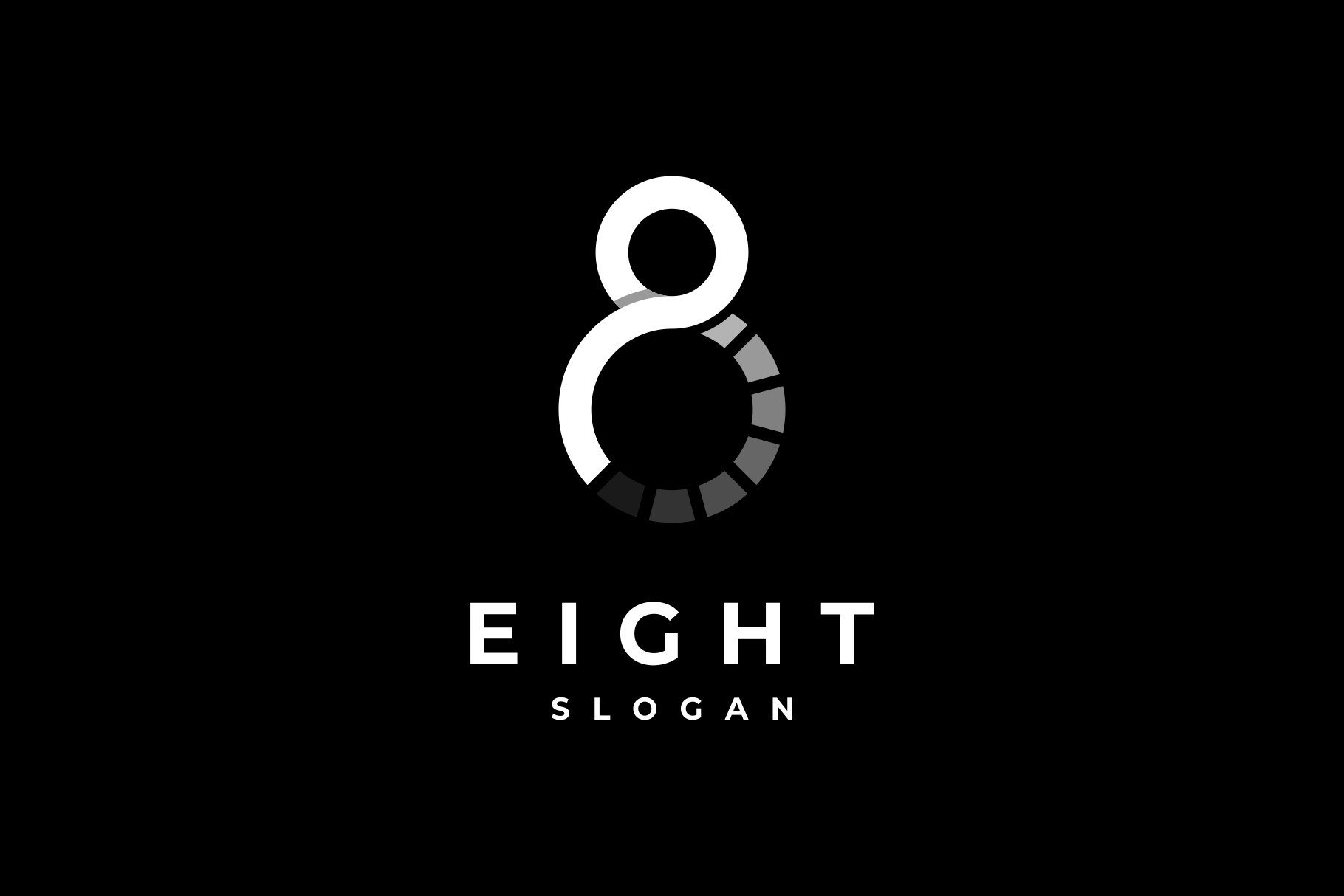
The design firm Eight Inc. created a logo that plays with both numbers and symbols. Their logo is a stylized "8," but within its curves, you can also see the infinity sign. This dual meaning shows ideas of endless creativity and possibility. For a design company, this is a perfect metaphor—design that lasts, with no limits.
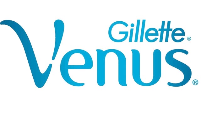
Gillette's Venus brand uses a subtle but thoughtful design. Within the flowing, elegant logo, you can find a Venus symbol, representing femininity. It ties perfectly to the brand's identity as a women's shaving line. The smooth curves of the lettering also suggest softness and care, aligning with the product's promise.
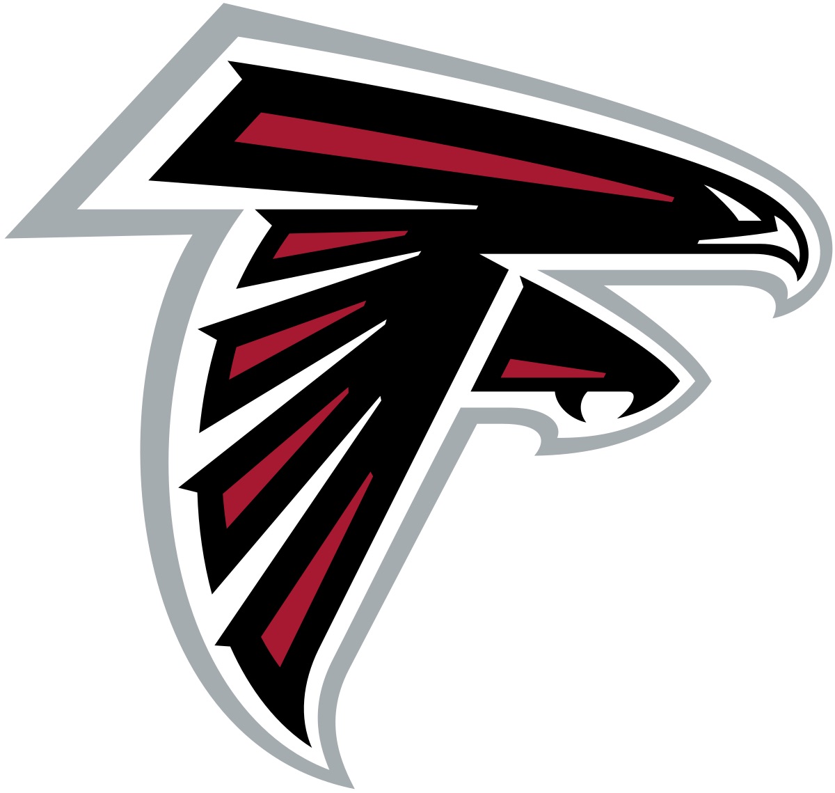
The Atlanta Falcons' logo shows a fierce bird in motion. Its sharp wings and body form the outline of an "F," standing for Falcons. The angular design suggests speed, aggression, and strength, which perfectly match the sport of football. It's bold, striking, and instantly recognizable as a team emblem.
Logos are not just about looking good. They carry deeper ideas that connect people to a brand in powerful ways. When logos hide clever meanings, they instantly become more engaging and unforgettable.
When people notice a hidden detail in a logo, they feel curious and excited. Think about the arrow in the FedEx logo or the "31" in Baskin-Robbins. These little discoveries make us pause and smile. Once you spot it, you can't unsee it. This spark of curiosity makes the logo stick in your mind much longer than a plain design. It becomes a conversation starter and makes you want to share it with others.
A clever logo makes people feel connected to the brand. For example, the hidden handshake in the Hyundai logo shows trust and partnership. These emotions make customers feel valued. When a logo speaks to feelings rather than just appearing visually appealing, it creates a bond. People are more likely to remember the brand because they also remember how the logo made them feel.
Logos with hidden meanings reveal a lot about the brand's character. For instance, Google's colorful design shows creativity and playfulness. The Adidas mountain stripes reveal ambition and overcoming challenges. Without saying a word, the logo tells us what the company stands for. This silent storytelling helps people quickly understand the brand's personality and identity.
In a world filled with logos, hidden meanings make one brand different from another. Anyone can create a simple symbol, but adding a clever twist makes it unique. Look at Amazon's logo, where the arrow connects "A to Z," showing variety and customer satisfaction. This little secret makes the design stronger and separates it from competitors. People are more likely to remember a logo that surprises them in a good way.
Hidden meanings are fun to discover, and people love sharing them with friends. Imagine telling someone about the peacock in NBC's logo or the cyclist hidden in the Tour de France. It feels like uncovering a secret. This sharing builds word-of-mouth promotion without the brand spending anything extra. Every time people talk about the hidden detail, the logo gains more recognition and power.
Logos with hidden details stay in memory for a long time. Even if someone does not use the brand daily, the bright design sticks with them. The Sony VAIO logo that blends analog and digital symbols is a perfect example. Years later, people still remember it. A lasting impression like this is priceless for any company because it means people will recall the brand whenever they see the logo again.
Logos are not only about looks, they are about connection. The hidden meanings inside these creative designs make us see brands in a new way. They remind us that small details can tell big stories. When you discover the thought behind a logo, it feels more meaningful and memorable.
From clever shapes to playful symbols, each of these designs shows how powerful creativity can be. Next time you spot a logo, take a moment to look closer. You might find a hidden message waiting for you. That little surprise is what makes logos more than just symbols; they become lasting stories we carry with us.
We Create Unique Digital Experiences For Global Brands By Integrating AI, Innovative Design, And Advanced Technology.


Sakib Al Hasan
Leave a Reply